

The goal of this project was to develop a comprehensive branding and wayfinding campaign for a city of my choice. The campaign included extensive research, a logo redesign, district signage, banner and map signage, pedestrian directional signage, and an accompanying app for the district. I chose to focus on St. John’s, Newfoundland, capturing the spirit of the city while ensuring a cohesive and functional visual system.
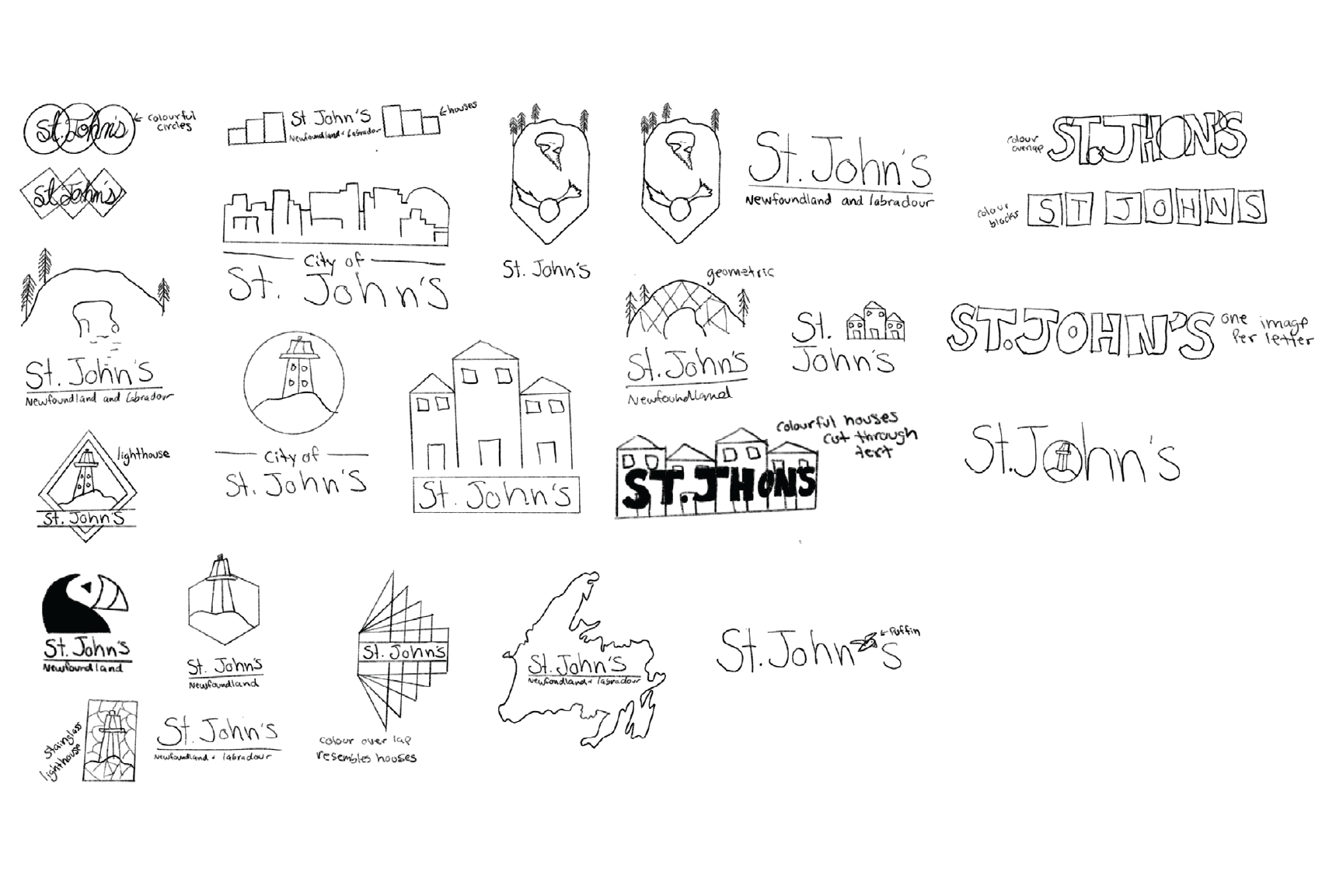
The project began with thorough research, mind mapping, and sketching to define the creative direction. I focused on symbolizing the welcoming and vibrant atmosphere of St. John’s, inspired by the colorful houses of Jelly Bean Row—a representation of the city’s lively character and friendly community.

Logo Redesign
1. Mind Mapping & Sketching: I explored different concepts that would reflect St. John’s charm and history.
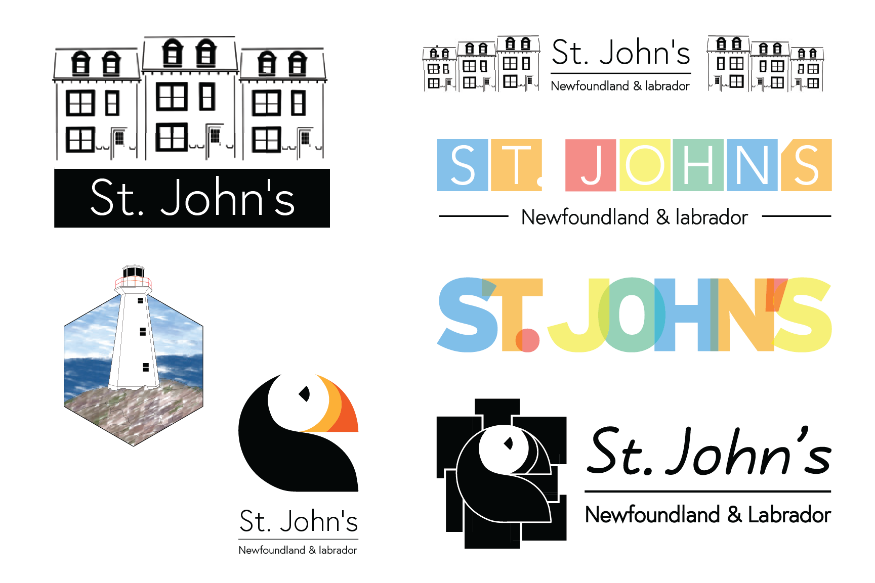
2. Round One Digital Variations: I created several digital logo concepts, experimenting with shapes and colours to represent the districts.
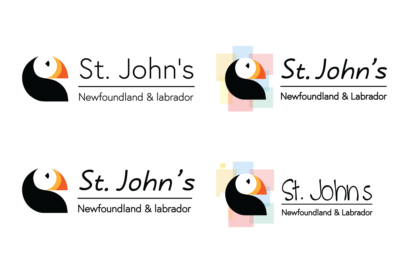
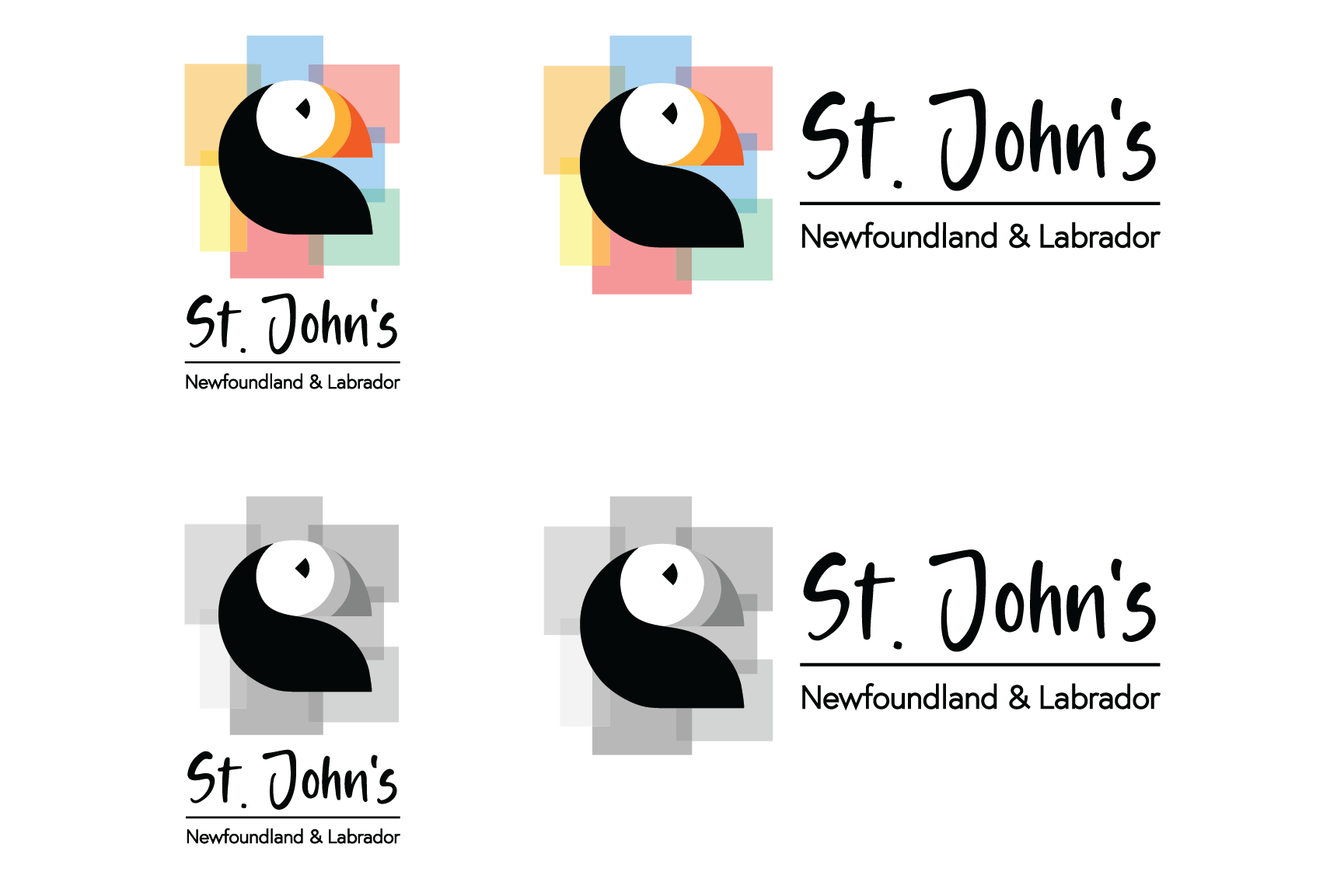
3. Refinement & Final Design: After iterating and narrowing down the options, I finalized a logo inspired by Jelly Bean Row’s vibrant houses. Each colour in the logo represents a different district in the city, creating a cohesive visual system.

Wayfinding System
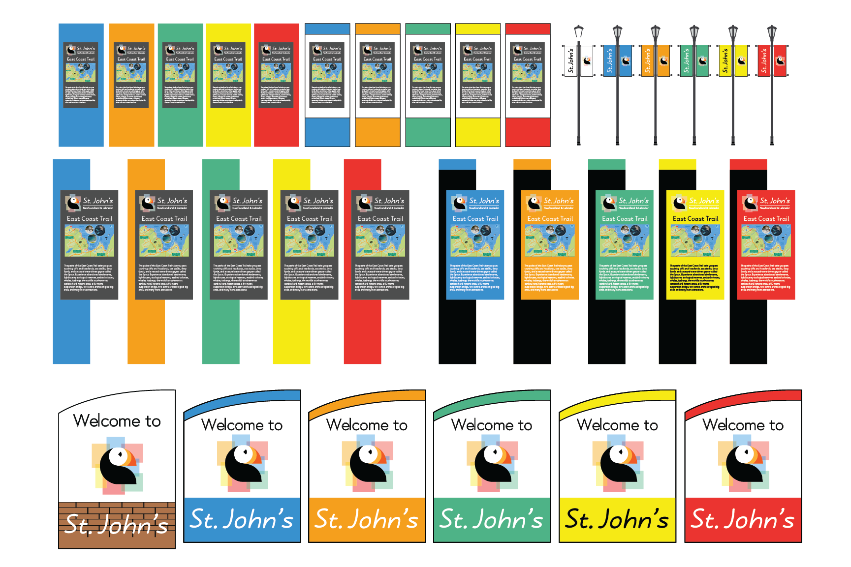
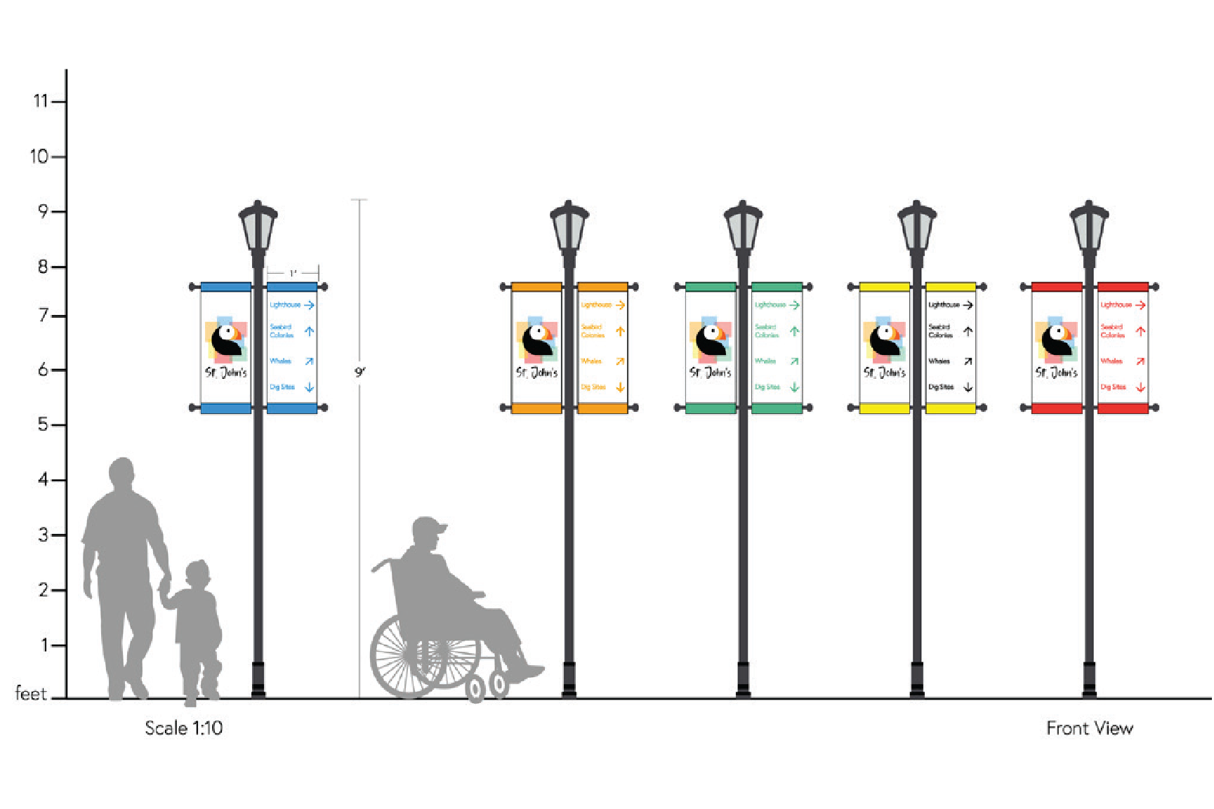
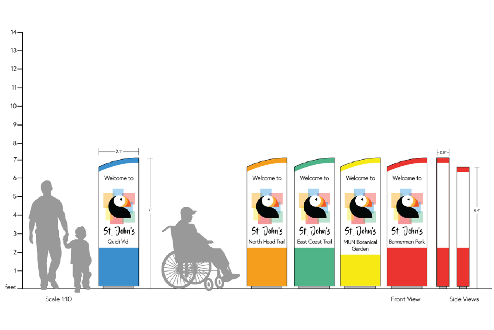
For the district signage, I aimed to balance functionality and environmental harmony. I combined pedestrian directional signage with banner signage to reduce visual clutter along the trail and preserve the surrounding nature. Each district’s signage was colour-coded to match the logo, ensuring clarity and consistency.
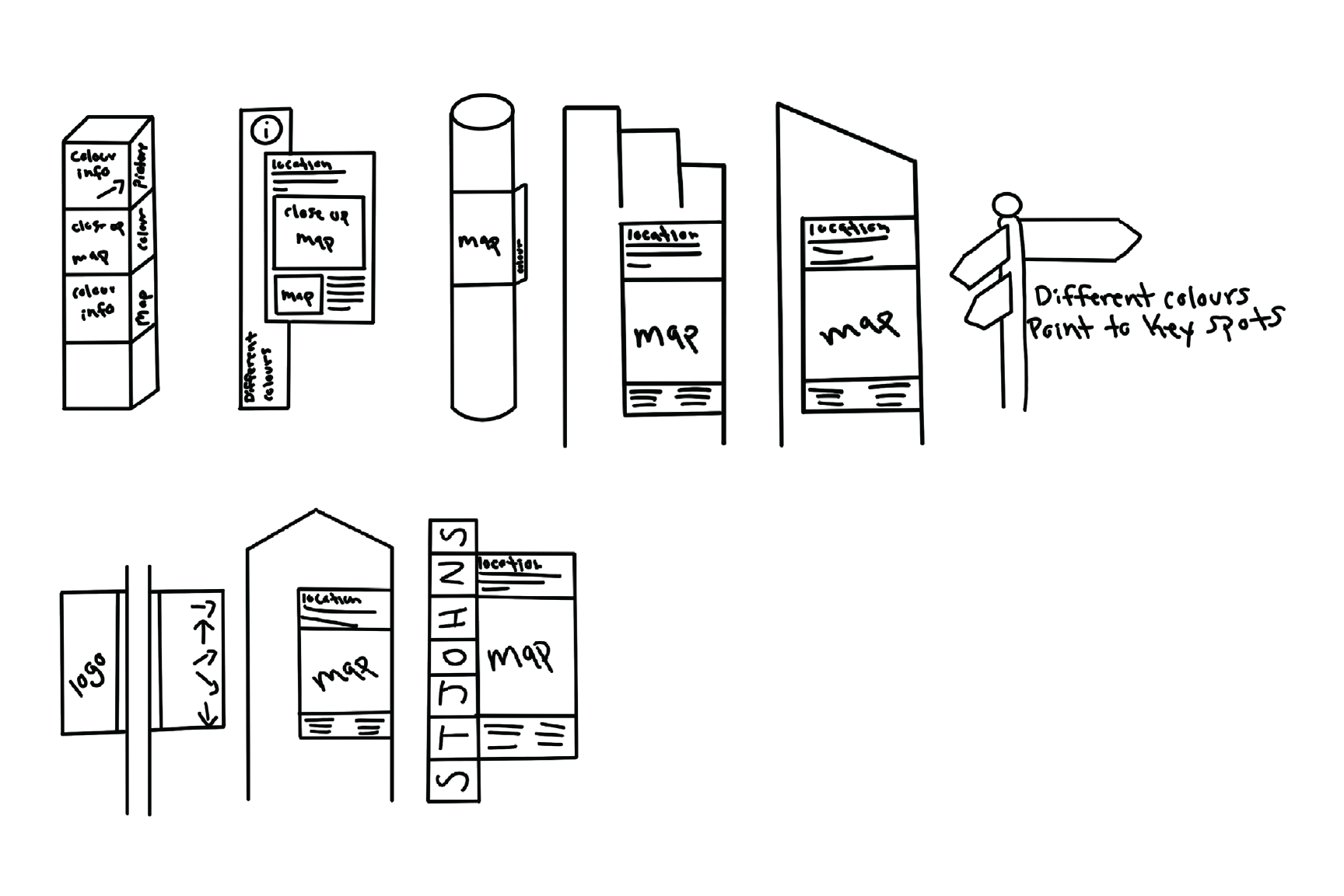
1. Sketching Concepts: Initial sketches focused on blending design and practicality without disturbing the natural landscape.
2. Digital Variations: I created multiple digital iterations, refining the layout and colour scheme.
3. Final Design & Mockups: The final signage designs were presented with to-scale mockups showing all angles, complete with people for reference to demonstrate size and usability.
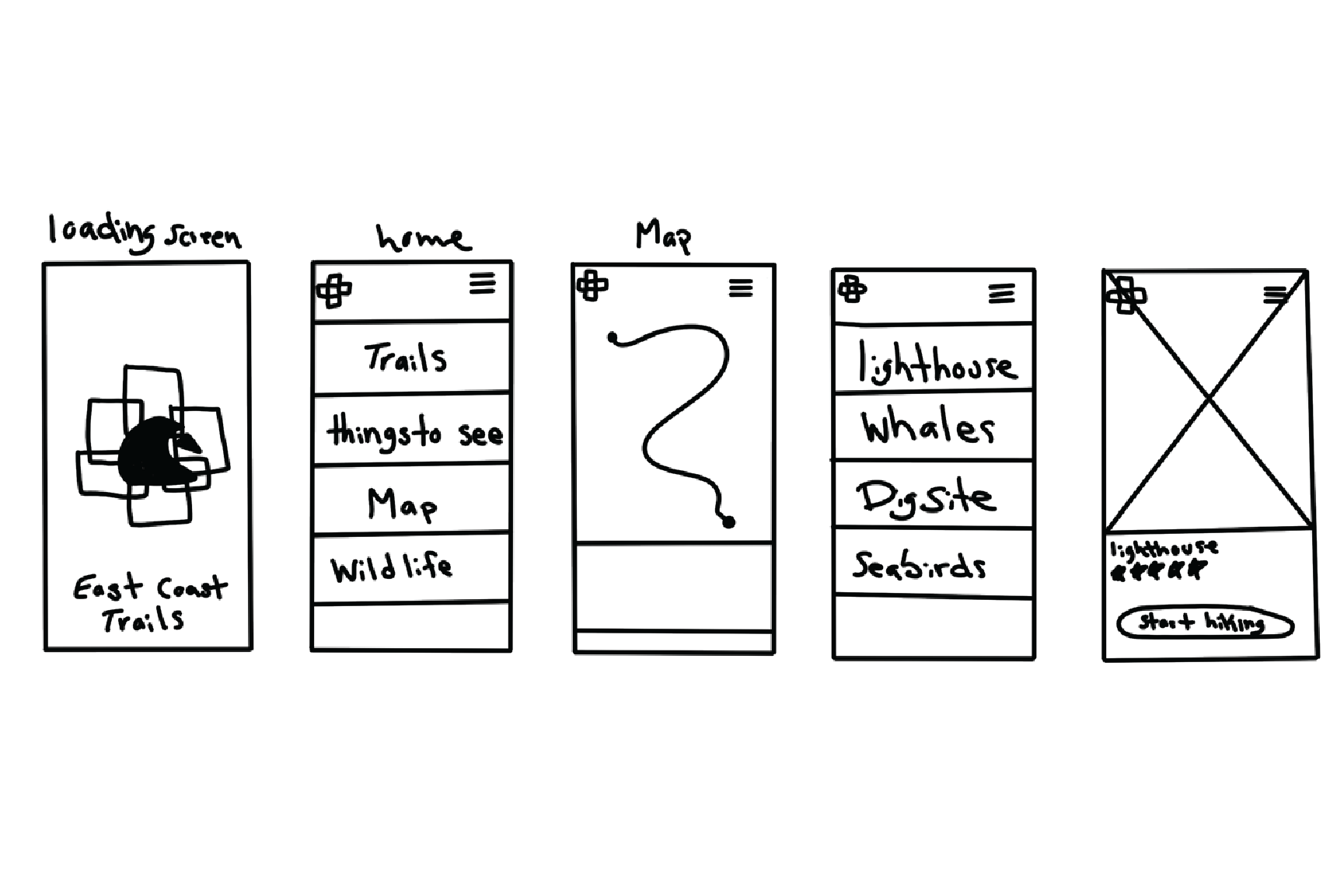
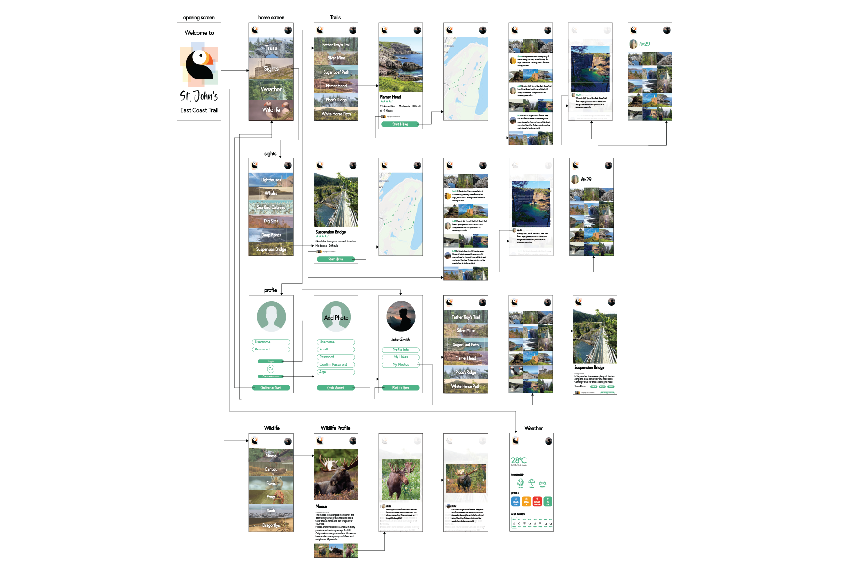
App Design
The district app was designed to enhance the experience for visitors and locals alike. The app provides information on current weather conditions, a detailed map of the trails to help users navigate, and highlights of unique sights they may encounter along the way.
1. Sketching & Wire framing: I began with hand-drawn sketches and wireframes to map out the user experience.
2. Digital Variations: The final app design focused on simplicity and functionality, ensuring an intuitive interface for users to access essential information quickly.
This seven-week campaign successfully captured the spirit of St. John’s while creating a functional, user-friendly experience for both residents and tourists. The cohesive visual identity and wayfinding system provided clarity and consistency across all touch points, celebrating the city’s vibrant personality and natural beauty.